

I’m now satisfied. Carry on. 😄
Cheers :) getting an amazing new banner soon!
Rotate icon 180°.
Blue is up on Lemmy.
Thanks for the reminder. The icon and the banner have been made & updated accordingly.
The banner looks normal in the web version, however this is how it looks in Jerboa for me. Is it still maybe a work in progress?
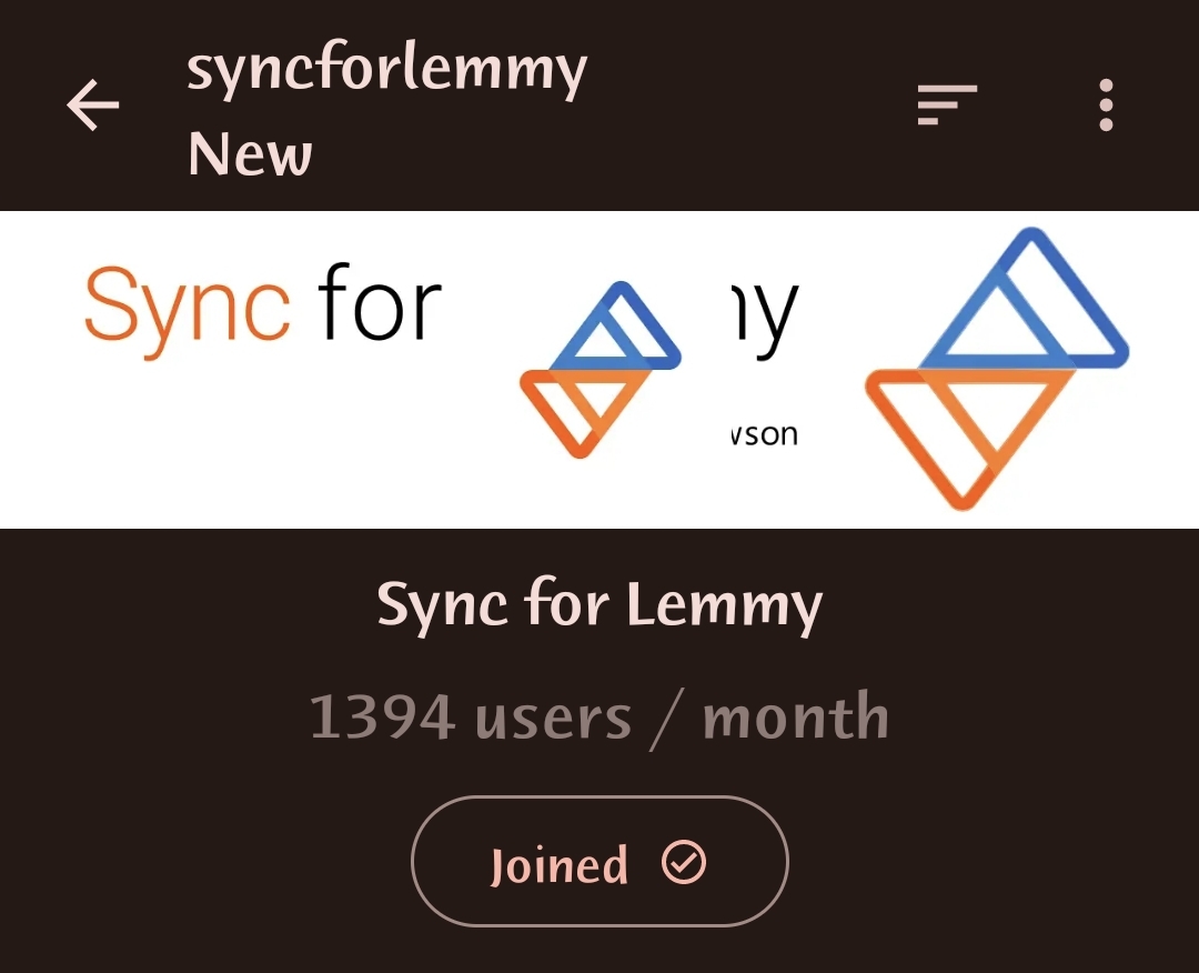
I’m guessing this is more about how Jerboa places the community icon. Not sure we’d be able to fix it unless the devs update it :)
It really was bugging me that the “official” community didn’t have one while the backup did. =P
Until these recent conversations started it never even occurred to me that the logo was meant to represent up and down votes…
Does this mean Sync will have orange for upvotes and blue for downvotes, unlike Lemmy’s defaults?
Based on screenshots that have been shared out on the Discord and the preview images on the Play Store listing, that appears to be the case. Upvoted posts are still marked orange. Whether that will change at some point after release, I’m not sure, but I’m fine with it either way.
I think the colors are arbitrary, though. Jerboa, for example, just sets the colors to match my Material You theme, so my upvotes are brown and my downvotes are burgundy.

