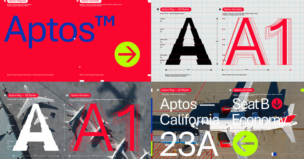
I’m not entirely sure why but Calibri has always mildly annoyed me. Maybe because it was the new default at one point and I preferred something else. Or maybe because I felt that the default font size should be 10 or 12 points not…11 (pffft huff) Maybe it was just misplaced resentment for having to use Office products (at work). The new one has kind of a fun look, though. Maybe I will enjoy it.
The letters are more pleasant, but my god, that kerning is absolutely awful. It’s horribly inconsistent, and some combinations of letters are spaced apart by half the size of an entire space, while others have barely any spacing.
For as bad as calibri is, at least it was easy to tell words apart.

https://office-watch.com/2023/aptos-calibri-comparison/
Slidey thing to compare <3
Almost feels like it’s more about kerning than actual character changes. Though I do prefer the symbols of calibri.
The kerning is absolutely awful.
Just look at the “cr” in “hovercraft”.
Or the “zy” in “lazy”.
Or the “rtz” in “quartz”.
Or “sph” in “sphinx”.
I get that kerning is hard, but the inconsistencies in Aptos actually make it harder to read, despite the glyphs being wider and more distinct.
The hero we need! Ty!
I’m not entirely sure why but Calibri has always mildly annoyed me. Maybe because it was the new default at one point and I preferred something else. Or maybe because I felt that the default font size should be 10 or 12 points not…11 (pffft huff) Maybe it was just misplaced resentment for having to use Office products (at work). The new one has kind of a fun look, though. Maybe I will enjoy it.
I recall when Times New Roman was default. Calibri felt strange at first.
The letters are more pleasant, but my god, that kerning is absolutely awful. It’s horribly inconsistent, and some combinations of letters are spaced apart by half the size of an entire space, while others have barely any spacing.
For as bad as calibri is, at least it was easy to tell words apart.